Does the Uptick in Global Surface Temperatures in 2014 Help the Growing Difference between Climate Models and Reality?

This post includes calendar year 2014 global surface temperature data from GISS and NCDC.
I thought it would be interesting to begin the introduction as if GISS and NCDC were announcing year-end business profits at their press conference today. [sarc on.]
INTRODUCTION
Today, two of the world’s climate-industry giants—the NASA Goddard Institute for Space Studies (GISS) and the NOAA National Climatic Data Center (NCDC)—posted their much-anticipated annual results for 2014. According to GISS, global surface temperature anomalies were an astounding +0.02 deg C higher in 2014 than they were in 2010, making the 2014 results the highest in the history of GISS. These record-breaking results from GISS are under the guidance of their new Deputy Director, Gavin Schmidt. If you’re not familiar with numbers that remarkable, they’re read two one-hundredth of a deg C, which is equal to less than four one-hundredths of a deg F. According to the NCDC, their global surface temperature results were +0.04 deg C higher in 2014 than they were in 2005 and 2010, their two previous best years. The warmest years are within the margin of uncertainty for the data*, making it impossible to determine which year was actually warmest. Even so, these results bring new hope to global warming investors, who have had to endure disappointing results in recent decades. GISS and NCDC are once again showing why the CO2 obsessed turn to them for global warming data. GISS and NCDC are global-warming industry leaders…known for eking out record years from poor source data, even during these hard times of global warming slowdown. In related news, based on similar source data, Berkeley Earth too announced record highs in 2014, but only by 0.01 deg C. [sarc off.]

Figure 1
*The uncertainties are assumed to be the same as those shown in the Berkeley link (in the range of +/- 0.04 to 0.05 deg C).
Those results, especially the NCDC results, appear somewhat curious. We showed in the post here that the Meteorological Annual Mean (December to November) were 0.01 deg or less between 2014 and 2010. Then again, the differences between the Meteorological Annual Mean and Calandar Mean are being measured in hundredths of a deg C.
There will be all sorts of bizarre proclamations now that the 2014 global surface temperature data from GISS and NCDC (and Berkeley Earth) were found to be a tick warmer than the prior warmest year(s).
What eludes those making the claims—or what they are purposely directing attention away from—is the growing disagreement between the real world and the global surface warming simulated by climate models.
MODEL-DATA DIFFERENCES
We’ll use the GISS data for this discussion. Similar graphs, but with the NCDC data, follow later in the post.
The teeny-tiny uptick in global surface temperature anomalies does not really help the growing difference between observations and the projections by climate models…because the modeled surface temperatures continue to rise, too, and modeled surface temperatures are rising faster than observations.
Figure 2 presents the annual GISS global surface temperature data for their full term of 1880 to 2014. Also shown on the graph is the average of all of the outputs of the simulations of global surface temperatures by the climate models stored in the CMIP5 archive, models with historical forcing through about 2005 and with RCP8.5 (worst case) forcings thereafter. The predictions of gloom and doom are based on the worst-case scenarios so we might as well use them for the comparison. The models stored in the CMIP5 archive were used by the IPCC for their 5th Assessment Report. Anomalies were calculated against the averages for the period of 1880 to 2014 so that the base years did not bias the presentation.

Figure 2
We use the average of the model simulations (the multi-model ensemble member mean) because it best describes how surface temperatures would vary if (big if) they varied in response to the numerical values of the forcings (anthropogenic greenhouse gases, aerosols, etc.) used to drive the climate models. For a further discussion, see the post here.
It’s very plain to see that the observed global surface temperatures have not risen as fast as predicted by climate model simulations in recent years.
Let’s put the growing difference between models and observations into perspective. We’ll subtract the annual values of the data from the modeled values, and we’ll smooth the difference with a 5-year running-average filter (centered on the 3rd year) to reduce the volatility from El Niños, La Niñas and volcanic aerosols. See Figure 3. The horizontal red line is the value of the most recent model-data difference—for the 5-year period of 2010 to 2014. Over that period, the model projections are running on average about 0.17 deg C too warm. Keep in mind, these climate model projections are only a few years old and already their performance is terrible.

Figure 3
We can also see that the models have not simulated surface temperatures this poorly (have not deviated 0.17 deg C from reality) since the 5-year period centered on about 1910. That earlier deviation was caused by the model failure to properly simulate the cooling of global surfaces that took place from the 1880s to about 1910. The present deviation is caused by the model failure to simulate the recent slowdown in global warming.
30-YEAR MODEL-DATA TRENDS
The carbon-dioxide obsessed often say we need to look at 30-year trends, so let’s do exactly that. See Figure 4.

Figure 4
An explanation of what’s shown in that graph: Each data point presents the 30-year linear trend (warming and cooling rate) as calculated by MS EXCEL in deg C/decade. The last data points at 2014 are the linear trends (warming rates) for the 30-year period of 1985-2014. Working back in time, the data points at 2013 are the warming rates for the period of 1984-2013…and so on, until the first data points at 1909, which show the model and observed trends for the period of 1880 to 1909. The term “trailing” in the title block indicates the data points are keyed to the last year of the 30-year terms.
The 30-year period when global surfaces cooled fastest ended about 1909. At that time, the models showed surface temperatures should have been warming if Earth’s surfaces responded to the forcings in the same way as the climate models. Obviously they didn’t. From the 30-year periods ending in 1909 to just before 1925 (when the data trends were still negative but the negative trends were growing smaller) global surfaces were cooling, but the cooling rate was decelerating. (To simplify this discussion, keep in mind that the years discussed are the last years in 30-year periods.) Starting just after 1925 and running through about 1945, Earth’s surfaces had warmed and the observed 30-year warming rate grew faster (accelerated), while the models did not show the same multidecadal variability in warming over that time.
IMPORTANT NOTE: In fact, for the period ending in 1945, the climate models show that global surfaces should only have warmed at a rate that was about 1/3 the observed rate—or, in other words, from 1916 to 1945, global warming occurred at a rate that was about 3 times faster than simulated by climate models—or, to phrase it yet another way, natural variability was responsible for about 2/3rds of the warming from 1916 to 1945. If Earth’s surfaces warmed much faster than simulated by the models, then the warming was caused by something other than the forcings used to drive the climate models…thus it must have been natural variability. Of course, that undermines the claims that all of the global surface warming in the latter part of the 20th Century was caused by man’s emissions of carbon dioxide. If natural factors were capable of causing about 66% of the global warming from 1916 to 1945, there is every reason to conclude that a major portion of the global surface warming during the latter warming period was caused by natural factors. The fact that the models better align during the latter part of the 20th Century is not proof that the warming in that period was caused by manmade greenhouse gases…the climate models have already shown that they have no skill at being able to simulate global surface temperatures over multidecadal periods. [End note.]
From 1945 to about 1964, observed global warming over 30-year time spans decelerated at rates that were much faster than simulated by models. But the modeled trends aligned with the data from the mid-1950s to the late 1960s, then diverged slightly during the 1970s and realigned until about 2003.
Over the last 11 years, the observed 30-year global warming rates decelerated slightly while the climate models show that global warming should have continued to accelerate…if carbon dioxide was the primary driver of global surface temperatures. While the 30-year trends do not show global cooling at this time, they also do not show global warming accelerating as predicted by climate models…and that is the problem that climate scientists are still trying to explain and coming up with dozens of excuses. If history repeats itself, global warming will continue to decelerate, maybe for as long as another 20 years.
30-YEAR MODEL-DATA TREND DIFFERENCES
Figure 5 shows the differences between the modeled and observed 30-year trends (trailing) in global surface temperatures. Referring back to Figure 4, the data trends were subtracted from the modeled trends. For the 30-year period of 1985 to 2014, the models show that global surfaces should have been warming at a rate that’s about 0.085 deg C per decade faster than has been observed. The last time the models showed 30-year global warming rates that were that much faster than observed was around 1920. Now consider again that these climate model projections are only a few years old.

Figure 5
NCDC GLOBAL SURFACE TEMPERATURE DATA
Figures 6 through 9 are the same as Figures 2 to 5, but with the NCDC global land+ocean temperature anomaly data. The curves are so similar to those with the GISS data that there’s no reason to repeat the dialogue.
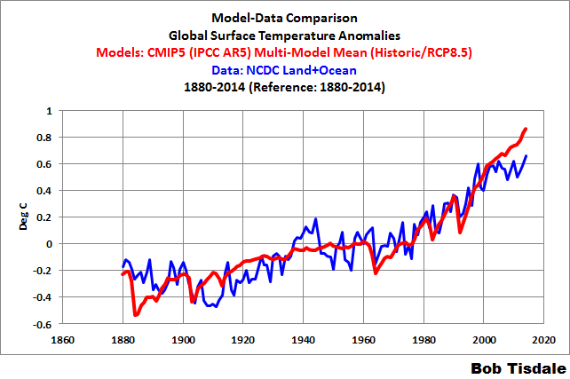
Figure 6
# # #
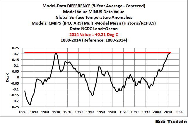
Figure 7
# # #

Figure 8
# # #

Figure 9
THE REASON FOR THE 2014 UPTICK IN GLOBAL COMBINED SURFACE TEMPERATURES
Figure 10 presents the global sea surface temperatures for the period of 1997 to 2014 based on NOAA’s ERSST.v3b data, which is used by GISS and NCDC for their combined global land plus sea surface temperature datasets. The 2014 value was 0.044 deg C warmer than the previous warmest year 1998. Obviously, because the oceans cover 70% of the surface of the planet, the uptick in global combined surface temperatures was the result of the larger uptick in global sea surface temperatures.

Figure 10
We have been discussing for more than 6 months the reasons for the record high sea surface temperatures in 2014. Recently, we confirmed that the uptick in global sea surface temperatures was caused by the unusual weather event in the eastern extratropical North Pacific. See the post Alarmists Bizarrely Claim “Just what AGW predicts” about the Record High Global Sea Surface Temperatures in 2014. No other ocean basin had record-high sea surface temperatures in 2014.
The following is a reprint of a discussion from that post under the heading of On the Record High Sea Surface Temperatures in 2014:
Again, of the individual ocean basins, only the North Pacific had record high sea surface temperatures this year, and the weather event there was strong enough to cause record warm sea surfaces globally, in the Pacific as a whole and in the Northern Hemisphere.
We’ve been discussing the record high sea surface temperatures since the June Sea Surface Temperature (SST) Update. We identified the location of the unusual weather event, the likely reasons for the record high sea surface temperatures and the fact that climate models could not explain that warming in the post On The Recent Record-High Global Sea Surface Temperatures – The Wheres and Whys. We discussed the topic further in other posts, including Axel Timmermann and Kevin Trenberth Highlight the Importance of Natural Variability in Global Warming… Our discussions of the unusual warming event in the eastern extratropical North Pacific were confirmed by the 2014 paper by Johnstone and Mantua (here) which was presented in the post Researchers Find Northeast Pacific Surface Warming (1900-2012) Caused By Changes in Atmospheric Circulation, NOT Manmade Forcings. Jim Johnstone, one of the authors of the paper, joined us on the thread of the cross post at WUWT and provided a link to his webpage. There you can find a link to the paper. Also see his comment here for an update on the recent unusual warming event in the extratropical North Pacific. Under the heading of NE Pacific coastal warming due to changes in atmospheric circulation at his webpage, Jim Johnstone updated one of the graphs from their paper and wrote:
Jan 1980 – Nov 2014. NE Pacific monthly coastal SST anomalies (red) and SST modeled from regional SLP. Recent warming from Jan 2013 to Nov 2014 occurred in response to low SLP over the NE Pacific, consistent with long-term forcing. Gray bars mark data beginning in January 2013 that were not included in the study. Negative SLP anomalies generate anomalous cyclonic winds, reducing the mean anticyclonic flow and winds speeds throughout the Arc. The drop in wind speeds reduces evaporation rates, producing positive surface latent heat fluxes and SST increases.
Also refer to the NOAA summary and FAQ webpage about Johnstone and Mantua (2014) for discussions about the paper in less-technical terms.
As we’ve been saying for years, coupled ocean-atmosphere processes can and do cause regional warming, which, in turn, lead to the warming of ocean surfaces globally.
ONE LAST NOTE
The NOAA press release from Wednesday includes the following statements (my boldface):
NOAA and NASA independently produce a record of Earth’s surface temperatures and trends based on historical observations over oceans and land. Consistency between the two independent analyses, as well as analyses produced by other countries, increases confidence in the accuracy of such data, the assessment of the data, and resulting conclusions.
NOAA and GISS may produce the surface temperature data independently, using different methods to infill missing data, but they rely on the same sea surface temperature data (NOAA’s ERSST.v3b) and, for the most part, on the same land surface air temperature source data (NOAA’s GHCN). Though GISS does include a few other surface temperature datasets in areas where the GHCN data are sparse, they rely primarily on the same data for both land and oceans. They cannot be independent if the suppliers rely on the same source data.
CLOSING
As illustrated and discussed, while global surface temperatures rose slightly in 2014, the minor uptick did little to overcome the growing difference between observed global surface temperature and the projections of global surface warming by the climate models used by the IPCC.
This post will serve as the annual surface temperature update for GISS and NCDC. The full monthly update will follow later in the day or tomorrow.
SOURCES
See the GISS global Land-Ocean Temperature Index (LOTI) data page and the NCDC data are accessible here (can be very slow).


Comments
Post a Comment