“Unprecedented” Model Discrepancy, 2014 was the fourth highest in “recorded” history
Judy Curry recently noted that Phil Jones’ 2014 temperature index (recently the subject of major adjustments in methodology) might be a couple of hundredths of degree higher than a few years ago and alerted her readers to potential environmental NGO triumphalism. Unsurprisingly, it has also been observed in response that the hiatus continues in full force for the satellite records, with 1998 remaining the warmest satellite year by a considerable margin.
Equally noteworthy however – and of greater interest to CA readers where there has been more focus on model-observation discrepancy – is that the overheating discrepancy between models and surface temperatures in 2014 was the fourth highest in “recorded” history and that the 5 largest warm discrepancies have occurred in the past 6 years. The cumulative discrepancy between models and observations is far beyond any previous precedent. This is true for both surface and satellite comparisons.
In the figure below, I’ve compared CMIP4.5 RCP4.5 models to updated surface observations (updating a graphic used here perviously), adding a lower panel showing the discrepancy between observations and CMIP5 RCP4.5 model mean.
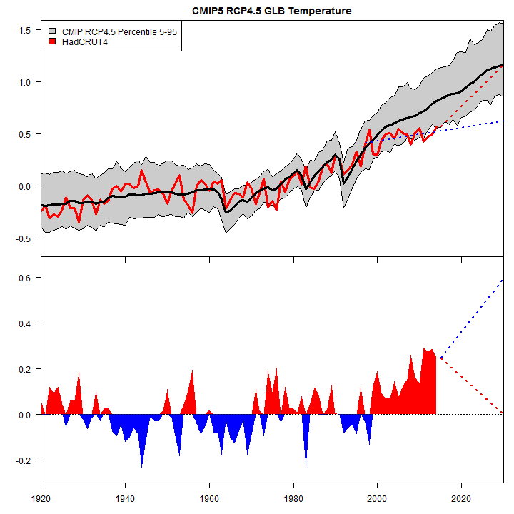
Figure 1. Top panel. CMIP RCP4.5 model mean (black) and 5-95% percentile envelope (grey) compared to HadCRUT4 (red). Dotted blue – the projection of the hiatus/slowdown (1997-2014) to 2030; dotted red – a projection in which observations catch up to CMIP5 RCP4.5 model mean by 2030. Bottom panel – discrepancy between CMIP5 RCP4.5 model mean and HadCRUT4 observations. All values basis 1961-1990.
During the hiatus/slowdown, HadCRU changed their methodology: the changes in methodology contribute more to the slight resulting trend in HadCRUT4 than the trend in common with the older methodology. But even stipulating the change in method, 2014 observed surface temperatures are somewhat up from 2013, but still only at the bottom edge of the confidence interval envelope for CMIP5 models. Because the CMIP5 model mean goes up relentlessly, the 2014 uptick in HadCRUT4 is far too little to catch up to the discrepancy, which remains at near-record levels. I’ve also shown two scenarios out to 2030. The dotted blue line continues the lower trend during the hiatus, while the dotted red line shows a catch-up to model mean by 2030. Reasonable people can disagree over which of the two scenarios is more likely. In either scenario, the cumulative discrepancy continues to build and reach unprecedented levels.
In the second graphic, I’ve done an identical plot for satellite temperature (RSS TLT), centering over 1979-1990 since satellite records did not start until 1979. The discrepancy between model TLT and observed TLT is increasingly dramatic.
 F IGURE 2. As above, but for TLT satellite records.
Reasonable people can disagree on why the satellite record differs from the surface record, but the discrepancy between models and observations ought not to be sloughed off because the 2014 value of Phil Jones’ temperature index is a couple of hundredths higher than a few years ago.
The “warmest year”, to its shame, neglected Toronto, which experienced a bitter winter and cool summer last year. For now, we can perhaps take some small comfort in the fact that human civilization has apparently continued to exist, perhaps even thrive, even in the face of the “warmest year”.


Comments
Post a Comment